10 Ways to Increase Your Website or Blog Subscribers
By Jeanne Berg
September 6, 2023
Subscribers are the life blood of any successful content-driven website or blog. While traffic numbers are important, at the end of the day it's your subscribers that pay the bills. This can be directly through charging for a subscription to your members area, or through selling / affiliate marketing to your newsletter list.
10 strategies you can use to get more subscribers:
1. Publish high-quality content
Create valuable, informative, and engaging content that addresses your target audience's needs and interests. High-quality content is the foundation of attracting and retaining subscribers to your membership website or blog.
2. Think 'niche'
To convert visitors and retain members, focus on a particular subject. A specialized, niche subject let you connect to your audience and deliver personalised and targeted content that will resonate with your website members.
Be sure to research whether there is a large enough audience in your chosen niche to make your site a worthwhile proposition.
3. Make it easy to subscribe
Place clear and compelling subscription CTAs throughout your website and blog posts. Encourage visitors to subscribe by highlighting the benefits they'll receive, such as exclusive content or updates.
Provide an enticing incentive for subscribing, such as a free e-book, checklist, webinar, or downloadable resource that aligns with your content niche. Make sure your lead magnet offers genuine value.
6. Guest blogging
Contributing content to someone else’s website is a great strategy to gain exposure and build subscribers.
Write guest posts for other reputable blogs in your niche. Include a bio with a subscription CTA linking back to your own blog.
7. Post in forums
It pays to be a helpful, active participant in forums that relate to your niche. People will quickly notice if you provide valuable information and are approachable. They will also be more inclined to visit your site or act on a promotional link.
8. Social proof
Showcase social proof, such as the number of existing subscribers or positive testimonials, to build trust and demonstrate the value of subscribing to your website.
9. Promote via social media
Share your blog posts and subscription offers on your social media platforms regularly. Leverage targeted ads to reach a wider audience and promote your membership website incentives.
10. Cross-promote
My final tip for adding subscribers is to find a blogger or site owner that publishes content that compliments your own (although doesn't compete with it) and offer to promote them, in return for them doing the same for you. This could be in terms of a guest article relationship, site ads, free giveaways, newsletter promotion, etc.
In summary
Remember that building a subscriber base takes time and consistent effort. It's also essential to engage with your members through regular email updates, newsletters, and by responding to their feedback and questions to maintain a strong and loyal community.
Jeanne Berg
As part of the SubHub team, I've been helping people build, grow and manage their membership websites for over eight years. I've written blogs about a variety of topics but particularly enjoy writing about web design. Though I'm a native New Yorker, I live in the United Kingdom and am raising two sons who speak with British accents. Outside work, I'm a dedicated volunteer gardener at my local park, countryside rambler and secret K-drama fan.
A landing page is a powerful tool in online marketing, designed to direct visitors toward a specific action. Unlike a full website, which serves multiple purposes, a landing page focuses on a single objective -convincing visitors to engage with your call to action.
Membership websites thrive on effective marketing strategies to attract, retain, and engage their members. Landing pages play a crucial role in achieving these objectives. They can be tailored to target specific segments of your membership, serve as sales pages, entice visitors with enticing offers, promote special promotions, and facilitate event sign-ups. In this article, we'll explore how to use landing pages effectively. Here are 5 ways to utilize landing pages to market your membership website.
Targeting Specific Segments with Landing Pages: Downsells and Upsells
One of the strengths of membership websites is their ability to cater to diverse member needs. You can use landing pages to target specific segments within your membership.
For instance, if you have premium and basic membership levels, create landing pages that offer upgrades (upsells) to basic members or downgrades (downsells) for premium members looking to reduce their subscription. Customize your messaging and incentives to match the unique interests and pain points of each group. You can do the same thing with prospective members. Here are a couple of downsell examples:
Downsells for prospective members
Social media is a great springboard for capturing leads, and selling via landing and sales pages. Let’s say you are using a funnel to attract leads that includes a webinar and a series of emails. A certain percentage of these leads will convert to sales, but for those who don’t, a downsell is a good way to keep the person in your orbit at a lower (or free) price. If you have someone who hasn’t taken you up on your membership offer, but is obviously interested in your service, a landing page offering 2 free months or a severely discounted rate for a short period of time might be enough to keep the lines of communication open.
Downsells for cancellations
Another downsell idea is to make an offer at the time of cancellation. If a member cancels, that is a perfect time to send an email with an offer to allow them to stay for a period of time at a discount. Your landing page could reiterate the benefits of membership and possibly offer a bonus of some kind to stay on “temporarily”. Hopefully, the member takes you up on it and decides to stay.
Sales Pages for your Primary Offering
Your primary offering is the cornerstone of your membership site. A dedicated landing page can serve as an effective sales tool for this core product or service. Provide detailed information about what your membership includes, showcase its value, and make the enrolment process simple and appealing. Use persuasive copy, compelling visuals, and clear calls to action to guide visitors toward membership sign-up.
You’ve probably seen sales pages that go on and on forever. But if you really examine them, you’ll find that they adhere to a fairly simple formula.
1. An attention-grabbing headline. Don’t get fancy with this. Simply state what the offer is and the benefit to the potential customer in plain words. Consider using power words and addressing the visitor's pain points to pique their interest.
2. Persuasive sales copy. Here is where you want to reassure the audience that you understand their pain and have the solution. Benefits should be emphasized over features. For example, a feature of your membership might be 6 20-minute videos per week. But what benefit is that? As a member, you can consume the content at your own pace; the content is detailed enough to provide real benefit; the content is also simplified enough that the time commitment won’t be overwhelming.
3. Testimonials. As many of these as possible will help to drive conversions. Try to ask current members for their feedback. Reviews and testimonials are one of the most effective ways to reassure potential clients that what is being offered will help them. Video reviews are even better than text. A mixture of both is ideal.
4. Effective call to action. Sounds like a no-brainer, but consider it carefully. Keep it simple. One call to action is sufficient - sign up, find out more, opt in, and book a call are popular calls to action.
5. Money-back guarantee. You may have heard that most customers don’t utilize money back guarantees, and you would be right. But the main reason to offer one is simply to give your clients peace of mind. It can be a real incentive to sign up for a trial subscription if there is essentially no risk.
Opt-in Landing Page with Free Gift
Enticing visitors with valuable free content is a powerful way to grow your membership website. You can create landing pages specifically for opt-ins where visitors can receive free gifts, such as PDFs, e-books, guides, or video tutorials, in exchange for their email addresses. These leads can then be nurtured through email marketing and eventually encouraged to become paying members.
It’s important to start and maintain an email list of potential clients. You can use an email service like Mailchimp to create a series of autoresponder emails to go out once someone has opted in. These types of landing pages can be much simpler than the sales page:
A compelling headline
A persuasive and easy to complete opt-in form
A list of benefits of your free gift.
A visually-compelling photo of your ebook or other gift.
Most landing opt-in pages ask only for name and email address to avoid barriers to signing up. Be sure to include a statement about your privacy policy. When describing your free gift, try to frame it as a quick solution to at least some of their problems. For instance, if your opt-in landing page offers a free 7-day email course on photography tips, describe it as a "7-Day Photography Mastery Course" and emphasize the benefits of improving photography skills in a short period of time.
Special offer page for promotions
Promotions can be a strong catalyst for membership growth. Landing pages tailored for special offers, such as free trials, limited-time discounts, or bundled packages, can significantly boost conversions. Clearly outline the offer's terms, benefits, and value, and emphasize the urgency of taking advantage of the promotion.
Be very clear about the benefits of this special offer, and how it differs from your regular pricing model. Are you offering a 20% discount? 60%? You can also make it a dollar amount. Either way, you want to encourage visitors to act quickly. Be sure to include urgency in your offer. You can do this by having the offer expire in a certain number of days or hours. Most platforms allow embedding of a countdown timer for this purpose. Lastly, make your call to action meaningful. Choose specific words that reinforce your offer, such as “Shop Now”, "Yes! I want to change my life Today!", "Save 50% Now".
Event or Webinar Sign-up Landing Pages
If your membership site hosts events, webinars, or exclusive content releases, dedicated landing pages can simplify registration processes and increase attendance. These pages should provide essential event details, schedules, and clear sign-up forms. Ensure that the pages are responsive for mobile users, as many people access such content through their smartphones.
Event and webinar registration pages have a dual purpose: to explain the benefits of the event or information they’ll receive on the webinar is one. The other is to be very clear on how the event is going to be accessed. If it’s an in-person event, how will they receive details of date, time and location? Are there any special instructions they need to be aware of before registering? if it’s an online event, be sure to make it clear how and when they are going to receive the access information.
Make the sign-up process as simple as possible, without too much customization of the registration form. If you can stick to name and email to start, you can always follow up later to request more information using your email service.
Conclusion
Landing pages are versatile tools for membership websites, catering to a variety of marketing needs. Whether you're targeting specific segments of your membership, presenting your primary offering, enticing opt-ins, promoting special offers, or facilitating event sign-ups, a well-designed landing page can significantly impact your membership growth and engagement.
To make the most of your landing pages, continually analyze their performance using web analytics, conduct A/B testing to optimize elements, and keep refining your strategies. By strategically implementing landing pages in the ways outlined above, you'll be better equipped to attract and retain members while achieving your membership website's goals.
SubHub’s landing page builder is the perfect tool to create landing pages for your sales and marketing campaigns. Simply click on Landing Pages and start building.
Ready to get started?
It's time to build your membership website
Book a demo and see everything that's possible with SubHub.
Landing pages have become a ubiquitous subject over the past few years. Once the province of only sophisticated marketers, every entrepreneur online now has multiple ways and reasons to set up landing pages.
Depending where your clients or potential clients are situated within your marketing funnel, you may have different reasons for implementing a landing page.
Here are three common types of landing pages:
1. Lead Capture Page.
If you're are a new business owner or are finding that your mail list is not growing at the pace you would want through other means, a landing page can help. Content should be straightforward on these pages and contain these four elements:
a) Your offer;
b) Benefits of the offer;
c) How your offer will address their pain points; and
Lead capture pages typically offer an incentive or lead magnet to visitors to offer up their email addresses (knowing full well they will receive emails from you). What kind of incentive depends on where your visitors to the page are in the buying cycle. Whether they are already customers or have never heard of you before, your mission is to provide a lead magnet that addresses a specific pain point that you know that audience is experiencing.
An SEO checklist or Ebook on making money with your membership website might be appropriate for experts in their field who want to monetize their knowledge online. If your audience is already familiar with you, a free coaching call or bonus pack might be something that would interest them.
Another hallmark of a good landing page is a lack of navigation links. With no other links to take visitors off your landing page and onto something else, you have limited their options to one: responding to your call to action. There is no point in allowing your potential client to get distracted and go off to browse the rest of your website. In fact, many experts say that having no navigation can increase conversions dramatically (up to 100%!).
2. Sales Page.
In the previous discussion of a lead capture landing page, brevity is your friend. Offering clear, concise copy and a simple call to action that visitors will jump at to alleviate their current problem will be your best bet. However, with a sales page, you want to get into all the nitty-gritty details of your offer. You may provide some bonus material for signing up, but the purpose of this page is to sell your solution.
Typically, visitors will be in the final stages of the buying cycle, have done their research, and are now looking to be convinced that your service is right for them. You'll want to include testimonials, awards, videos, and very detailed benefit statements, including a money-back guarantee. A clear call to action to 'Sign up' or Buy Now' should be sprinkled throughout the page.
3. Click-through page.
An excellent example of this is an offer of a free trial. The visitor clicks the button to, for example, start the free trial and is then directed to a sign-up page. Likely there will be more to complete than simply an email address, which is fine because the visitor should be ready to take this step after being somewhat familiar with your brand.
Now let's look at how best to drive traffic to your landing pages. Of course, you can investigate paid PPC ads with Facebook or Google, but first let's focus on free avenues to create traffic to your pages.
1. Social Media Marketing
If you have a following, social media is a perfect medium from which to send followers to your landing pages. For example, if you have social media followers who are not on your mailing list yet, a free offer can entice them to sign up. Facebook Lives and YouTube webinars could lead to either a click-through free trial page or to your sales pages.
Once your leads are in your email marketing system, they've given you permission to contact them in the future. That doesn't mean you're going to start sending links to your sales pages right away, though. These folks are simply not ready to buy yet. But it does allow you the opportunity to offer them a click-through type landing page for a free trial or a discount. That will take them into the middle of your sales funnel. Now you can start sending them emails. Emails are an excellent place to inform your tribe of upcoming webinars or new case studies. You can also provide the opportunity for feedback.
Ways to send viewers to your landing pages via email campaigns:
A welcome email sequence following a newsletter sign-up leads to a click-through landing page offering a free trial
A tutorial series of emails designed to help the user get the most from their free trial, pointing to a sales page
Use personalized emails to offer exclusive deals to current customers to reward them for purchasing and encourage engagement
Foster further engagement by responding to email replies
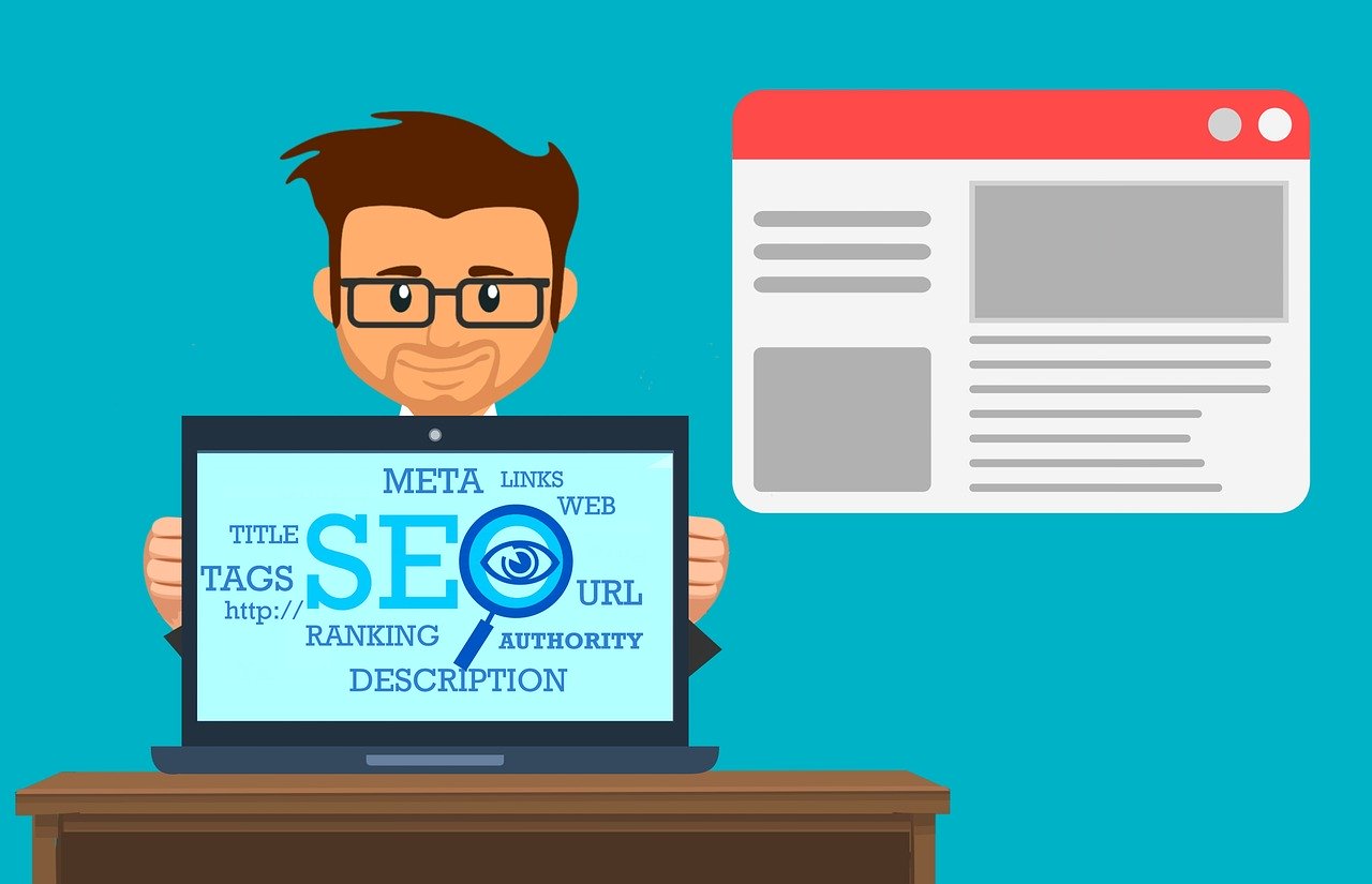
3. SEO
Include a Blog
It can be difficult to search engine optimize a landing page because there is not much content on the page. But there are remedies. Having a blog on your own website can boost SEO for your page. At the end of each blog post, offer a link to your landing page.
Establish Authority
You can enhance SEO for your landing pages by establishing yourself as an authority in your field. This is done through link-building and exposure on external websites.
Guest Posting
Providing guest blog posts gives you exposure in other (hopefully related) markets. Keep an eye on social media postings, blogs, and forums dealing with your area of expertise and strategically offer input. Submit business listings on industry-related directories on the web. These might be association sites, Google My Business, Yahoo, and Yelp for local businesses. These are excellent opportunities to share a link to a lead capture landing page.
Link Outreach
With the importance of being ranked competitively in Google, many companies now exist which offer link-building services. Most are legitimately reaching out to existing websites in your niche to request backlinks in exchange for payment. Be aware, this is a time-consuming process. But most established link-building services have amassed a network of reliable sources and can establish linking to your site in a reasonable time frame. Just make sure you know what kind of methods are being employed. The best bet is to hire someone based on a trusted referral.
How to SEO your landing pages:
Use "long tail" keywords on your landing page. Short popular phrases will be difficult to rank for, so stick to the particular purpose of the landing page as your primary keyword phrase.
Check your page load speed. The faster your page loads, the better for SEO purposes
Build authority and backlinks by posting on other websites (being mindful of their posting policies)
Utilize SEO tactics such as title tags, meta descriptions, H1 through H6 headings, and adding alt tags to all images on the page. For an extra SEO boost, be sure to include keywords in the URLs of your image files.
SubHub's landing page builder is live! Open a free SubHub trial and check it out:
What is the best way to boost SEO for your landing page?
Having a blog on your own website can boost SEO for your page through links to it at the end of each blog post. But you can enhance your SEO for your landing pages even more by establishing yourself as an authority in your field through link-building and exposure on external websites.
What are longtail keywords?
Short keywords phrases can often be difficult to rank for. But longtail keyords can be easier and less expensive to rank for because they are longer phrases with more detail included. Consider for example, the short phrase 'meditation retreat' vs. the longtail keyword 'Arizona meditation retreat for spiritual awareness'.
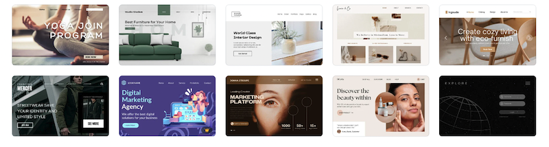
Creating a landing page that converts is essential for any membership website or web-based business. Landing pages are integral to building your audience, email list and customer base. A successful landing page needs to feature specific elements to optimise the conversion of visitors into leads. Below, we'll outline the five key elements to create a high converting landing page that generates leads.
What is a landing page?
A landing page is a specific webpage designed to convert website visitors into qualified leads by drawing them into your marketing funnel. It's typically the first page a visitor sees after clicking on an ad or a search engine result. It’s sometimes also referred to as a "lead capture page", "single property page", "static page", "squeeze page" or a "destination page".
It's designed to be a standalone page with the single purpose of generating leads or sales.
5 Key converting elements
There are several key elements required to create an effective landing page. These essential elements will increase the engagement of visitors thereby maximising conversion rates.
A compelling headline
A single call-to-action (CTA)
Highlight benefits
Design a scrollable page
Include social proof
1. Write a compelling headline
Write a compelling headline that immediately communicates the value of the product or service being offered. It should be brief and to the point. It should be designed for visual impact and prominently displayed above the fold, meaning that it is visible without the visitor having to scroll down the page.
If the visitor is being directed to your landing page from an ad or search, the headline on your landing page should align with your ad copy and the user’s search query.
It should be supported by an informative sub-headline that can go into more detail and depth. Together, the two pieces of copy reinforce your sales message.
2. Feature a single focused CTA
Your call-to-action (CTA) should prompt visitors to take a single next action - such as entering their email, signing up for a free trial or making a purchase. Conversion rates are always highest on landing pages with a single, clear call-to-action. Presenting visitors with a single purpose, increases the likelihood that they will act.
The CTA should be prominently displayed and easy to find. Distinguish it with a contrasting color or design element so it stands out from the rest of the page. This guides a casual reader scanning the page right to the conversion point.
Studies show that descriptive button copy, increases conversions. Incorporate the use of descriptive words on the button text. Instead of writing “Click here”, use copy that will engage visitors and inspire the desired action. Have the button copy identify and educate the visitor about the benefit they'll gain by clicking the CTA.
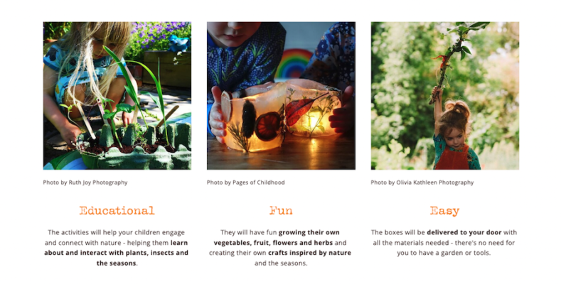
3. Highlight the benefits of your product
Persuasive copy is the foundation on which a high conversion rate is achieved. By informing visitors to the core benefits of your product, they'll be convinced of its worth. When writing your copy, keep these tips in mind:
Use simple, clear, specific language - Present information simply so the reader can digest it quickly. Keep copy short and to the point.
State the benefits before features - State the benefits the visitor will receive, then explain the feature that provides that benefit. This engages readers earlier, maintaining their interest.
Proofread - A landing page is the cover by which you will be judged - triple-check your spelling and grammar or risk a terrible first impression that could cost you.
4. Create a scrollable page
Formatting is the simplest step on the road to an improved conversion rate. There are a wealth of great templates out there for landing pages. Unbounce is just one source of inspiration. Your landing page should be designed to convey a journey with a start, middle and end.
Website visitors scan a page for the information they want. This is where formatting can make or break a landing page. Break up your copy and give sections a clear heading so that a reader can quickly find what they are looking for.
Visual content is essential to a landing page. Since the brain processes images 60,000 times faster than text, your page's images have the potential to influence a visitor's actions. Your images need to reinforce or expand upon the text, not distract from it. Make sure image files have been compressed so they load fast. A slow loading page can decrease your conversion rate.
Your landing page should also be optimized for mobile devices, as an increasing number of consumers are using their smartphones to browse the web. This means that the layout should be responsive and the text and images should be easily readable on a small screen.
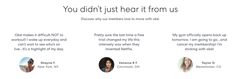
5. Include social proof
Social proof can be a powerful tool for converting those fence-sitters by providing credibility of your product. A cautious reader is far more likely to believe and be swayed by a third party than you. 90% of consumers read reviews before making a purchasing decision. Social proof can be displayed in a number of forms:
Testimonials and case studies -- they are a great way for readers to learn about your company, exactly what you do. Video testimonials are great, but post a choice quote next to them; the short attention span of the average visitor means they won't be willing to commit to watching a video.
Include quotes from great reviews, with a link to where the review is posted so that a visitor can trust that is authentic.
Got any awards? Show them off on your landing page, it will show visitors that you are at the top of your field and will inspire more confidence in you, leading to a higher conversion rate.
Embed tweets or Facebook posts from clients so a visitor can see that you have good customer service and that you are active on social media.
Show off your follower base - there is safety in numbers and if lots of people are following you, you must be good.
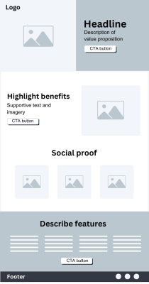
Landing page outline
The best landing pages include only essential information for the featured product. Anything more and you risk distracting visitors from taking the intended action.
This landing page outline is a guide for the optimal structure and persuasive elements needed to build a converting page.
Simple header
Enticing hero section
Product benefits
Feature descriptions
Supportive social proof
Single focused CTA
Doubt busting FAQ
Minimal footer
Conclusion
If you've followed the above advice then your landing page should be great, but it will never be finished. You should be continually optimising to ensure you are always converting the maximum percentage of visitors. Keep testing and monitoring the effect each change has on your conversion rates. You'll be surprised how small changes can make a big difference.
A well-designed landing page can be a powerful tool for converting website visitors into leads or customers. By focusing on a compelling headline, a strong call-to-action, relevant images and videos, and social proof, you can increase the chances of visitors taking the desired action on your website.
Free membership ebook
Download our five-step guide to a profitable membership website
Creating a converting landing page is essential to the lead generation for any membership website or web-based business. Landing pages are integral to building your audience, email list and customer base. A successful landing page needs to feature specific elements to optimise the conversion of visitors into leads. Below, we'll be outline the five key elements to create a high converting landing page that generates leads.
What is a landing page?
A landing page is a specific webpage designed to convert website visitors into qualified leads by drawing them into your marketing funnel. It's typically the first page a visitor sees after clicking on an ad or a search engine result. It’s sometimes also referred to as a "lead capture page", "single property page", "static page", "squeeze page" or a "destination page".
It's designed to be a standalone page with the single purpose of generating leads or sales.
5 Key converting elements
There are several key elements required to create an effective landing page. These essential elements will increase the engagement of visitors thereby maximising your conversion rates:
A compelling headline
A single purpose call-to-action (CTA)
Highlight benefits
Design a scrollable page
Include social proof
1. Write a compelling headline
Write a compelling headline that immediately communicates the value of the product or service being offered. It should be brief and to the point. It should be designed for visual impact and prominently displayed above the fold, meaning that it is visible without the visitor having to scroll down the page.
If the visitor is being directed to your landing page from an ad or search, the headline on your landing page should align with your ad copy and the user’s search query.
It should be supported by an informative sub-headline that can go into more detail and depth. Together, the two pieces of copy should reinforce your sales message.
2. Feature a single focused CTA
Your call-to-action (CTA) should prompt visitors to take a single specific next action - such as entering their email, signing up for a free trial or making a purchase. Conversion rates are always highest on landing pages with a single, clear call-to-action that is repeated throughout the landing page.Presenting visitors with a single purpose, increases the likelihood that they will act.
The CTA should be prominently displayed and easy to find. Distinguish it with a contrasting color or design element so it stands out from the rest of the page. This guides a casual reader scanning the page right to the conversion point.
Studies show that descriptive button copy, increases conversions. Incorporate the use of descriptive words on the button text. Instead of writing “Click here”, use copy that will engage visitors and inspire the desired action. Have the button copy identify and educate the visitor about the benefit they'll gain by clicking the CTA.
3. Highlight the benefits of your product
Persuasive copy is the foundation on which a high conversion rate is achieved. By informing visitors to the core benefits of your product, they'll be convinced of its worth. When writing your copy, keep these tips in mind:
Use simple, clear, specific language - Present information simply so the reader can digest it quickly. Keep copy short and to the point.
State the benefits before features - State the benefits the visitor will receive, then explain the feature that provides that benefit. This engages readers earlier, maintaining their interest.
Proofread - A landing page is the cover by which you will be judged - triple-check your spelling and grammar or risk a terrible first impression that could cost you.
4. Create a scrollable page
Formatting is the simplest step on the road to an improved conversion rate. There are a wealth of great templates out there for landing pages. Unbounce is just one source of inspiration. Your landing page should be designed to convey a journey with a start, middle and end.
Remember website visitors scan a page for the information they want. This is where formatting can make or break a landing page. Break up your copy and give sections a clear heading so that a reader can quickly find what they are looking for.
Visual content is vital to a landing page. Since the brain processes images 60,000 times faster than text, your page's images have the potential to influence a visitor's actions. Your images need to reinforce or expand upon the text, not distract from it. Make sure image files have been compressed so they load fast. A slow loading page can decrease your conversion rate.
Your landing page should also be optimized for mobile devices, as an increasing number of consumers are using their smartphones to browse the web. This means that the layout should be responsive and the text and images should be easily readable on a small screen.
5. Include social proof
Social proof can be a powerful tool for converting those fence-sitters by providing credibility of your product. A cautious reader is far more likely to believe and be swayed by a third party than you.90% of consumers read reviews before making a purchasing decision. Social proof can be displayed in a number of forms:
Testimonials and case studies -- they are a great way for readers to learn about your company, exactly what you do. Video testimonials are great, but post a choice quote next to them; the short attention span of the average visitor means they won't be willing to commit to watching a video.
Include quotes from great reviews, with a link to where the review is posted so that a visitor can trust that is authentic.
Got any awards? Show them off on your landing page, it will show visitors that you are at the top of your field and will inspire more confidence in you, leading to a higher conversion rate.
Embed tweets or Facebook posts from clients so a visitor can see that you have good customer service and that you are active on social media.
Show off your follower base - there is safety in numbers and if lots of people are following you, you must be good.
Conclusion
If you've followed the above advice then your landing page should be great, but it will never be finished. You should be continually optimising to ensure you are always converting the maximum percentage of visitors. Keep testing and monitoring the effect each change has on your conversion rates. You'll be surprised how small changes can make a big difference.
A well-designed landing page can be a powerful tool for converting website visitors into leads or customers. By focusing on a compelling headline, a strong call-to-action, relevant images and videos, and social proof, you can increase the chances of visitors taking the desired action on your website.
Free membership ebook
Download our five-step guide to a profitable membership website
One of the most important website metrics to measure is your conversion rate.
While your website visitor numbers, click-through rates, page views, time spent on site, number of pages visited, entrance and exit points and abandon rates are all important, if you're not using them to improve your conversion rates, what is the point of having them?
If your site, and the pages therein, are working properly, you should see decent conversion rates and sales. However, if anything is broken along the way, and you lead your visitors the wrong way at the wrong time, you are essentially providing an opportunity for them to leave before reaching your intended destination.
Each landing point on your website needs to be treated as the starting point that will lead your visitors step by step towards your conversion goal. Your goal could be your contact page, newsletter sign-up, store or subscribe page.
In order to guide your visitors from the starting point to the end point, you need to make sure each step along the way follows on to the next, without breaks or deviations.
Here are the steps to strong conversion:
Step 1: Building the Path to your Conversion Goal
Just like movie or a book needs to have a beginning, middle and an end, so should your website.
All the pages of your site, from start to finish, need to work together to bring the visitor towards the ultimate destination. However, with a website the start isn't always your homepage. Your visitors can enter your site at many different points, having clicked on different links on the search engines or other sites. They could hit your homepage, your product or features page, an article, your news page or anywhere else.
Of course, this makes building the path to your conversion goal a lot more challenging.
Essentially, every page of your site needs to be able to act like the very first step in the process, provide a link to the next page or acting as the middle step, and leading the visitor to your conversion goal.
Step 2: Creating Alternate Paths to your Conversion Goal
It's important to remember that not every website visitor has the same wants, needs or desires as the next. If you plan only a single path to your conversion goal, you are in danger of leading some of your audience down a path that isn't necessarily meant for them.
Your visitors can land on the same page and end up taking many different paths to the conversion goal. Some may want to read about your company first, others may want to read your testimonials first, while a number will want to read more about your product or service first. And of course, there are always those who are ready to 'buy now' with the minimum of persuasion required.
A path to the conversion should be created to provide each of your users precisely what they need in order to take the next step. Keep your visitor's options open but also be aware that too many options can create confusion and could lead to premature exits. Aim to narrow the options down to the most common and significant so you can be sure to meet the vast majority of your visitor's needs.
Step 3: Double-Check your Conversion Paths and Fix if necessary
Once you have created your conversion paths, it's important that you put yourself in the mind of your visitors and follow through as many paths as possible. This is where you'll find out if any steps are missing or broken, or if there are too many steps in the process.
Remember to take notes of obstacles that may disengage the visitor or may be an impediment to them reaching the conversion goal.
Look for missing information, errors on the pages, broken links and calls to action. You want to make sure that the visitor finds no hindrances to getting to the destination and are able to find all the information they need to make a confident purchase decision.
If you find any issues, make sure you fix what the problem is to improve the performance of each step along the way. Use website analytics to identify problem areas and determine if there are places where steps need to be added or removed. Your goal is to make the site as efficient as possible. Add no more steps than are needed and no fewer than it takes to get the job done.
Step 4: Remember to Create and Test New Paths
Once you have tested, fixed and retested your paths, don't rest on your laurels - it's time to start building and testing new paths. Consider your users carefully here. The first pass at creating paths should have been designed to hit the majority of your target audience. Now it's time to accommodate the rest. While the broader target is easier to hit, the smaller target is no less important. Build paths specifically for these users as they can be the source of many additional sales, and often result in higher conversion rates.
Step 5: Test New Stepping Stones
By this time your conversion process should hopefully be going strong and you'll have solid conversion rates. However, never stop looking for new opportunities to improve your conversion process. Test, test, and test some more, but remember your goal is improvement, not to add clutter.
Ready to transform your knowledge into an online business with a membership website but don’t have the time or skill to build it yourself? Our design service could be the solution.
Converting website visitors to paying members is of course, one of your primary goals as a membership business owner. There are many factors involved in making those conversions, but one method that could put you on the fast track is to provide a lead magnet.
Too many choices can overwhelm customers. Keeping your pricing options simple and clearly defined increases conversion by removing friction and reducing confusion.
Learn five high-impact strategies to boost user engagement on your website homepage, build trust and turn passive visitors into active customers. These practical tips are easy to implement will help you optimize your homepage for maximum results.
If you’re a yoga teacher attracting local students to your studio, you may be looking for opportunities to generate more income from your business. You may already have an online presence - a website, Facebook & Instagram postings, maybe even TikTok videos. But an online presence doesn't necessarily equate to an online business.
Identifying your customer persona, buyer persona or target audience profile, is crucial before launching a membership website. Understanding who your audience is allows you to create targeted marketing campaigns, improve user experience, develop relevant content, optimise pricing strategies, and foster long-term growth.
Are you ready to transform your knowledge into a thriving online business with a membership website but don’t have the time or skill to build it yourself?
Many people, with an expertise to share, are turning their knowledge into income by selling access to it using a membership website.
By putting your knowledge behind a paywall, you can turn it into a recurring revenue stream through the sale of memberships, courses, digital downloads and pay-per-view content.
Do you have an expertise to share but aren’t a web designer? Let our expert build your membership website.
Your site will be built using SubHub’s membership website builder
SubHub is an all-in-one membership platform that specialises in providing all the functionality you need to build, manage and grow a knowledge business. There’s no need for plugins or complex setups. Everything is in one place. SubHub makes membership easy.
Your site will include all the built-in features the SubHub platform has to offer - subscription levels, integrated payment gateways, course creator, landing page builder, forum, member directory, store and more.
What our design service includes:
Our design service will deliver a professionally-styled, secure and mobile-friendly membership website designed to convert visitors into paying subscribers for only $750 USD.
We’ll design an engaging public homepage to match your brand and showcase the benefits of your offerings and a member's homepage for when subscribers log in.
Intuitive and user-friendly navigation menus will be created so your visitors and members can easily find the content they're looking for.
Your content will be organised and enough will be uploaded to launch your site. We can even create bespoke interior pages.
After you provide content and visuals, our expert will then build your mobile-friendly website to showcase your brand and communicate your expertise.
We’ll send recorded run-throughs of the work in progress so you can provide your feedback.
We even record individual tutorials so you’re comfortable and ready to manage your website on your own.
SubHub is more than just a software
Our commitment to you doesn’t stop after we hand over the website to you. You’ll continue to receive outstanding support from our 5-star team which always impresses our clients with their dedication. We don’t send scripted replies but thoughtful information along with screenshots and bespoke video tutorials.
For a membership website, it’s not just about likes and followers; it’s about building trust, nurturing community, and converting interest into paying members.
Never underestimate the impact of a well-crafted teaser on a reader or website visitor. This brief yet informative text can be the deciding factor that compels a reader to fully engage with your content.
Creating a membership website homepage is more than just designing a visually appealing page; it’s about crafting an experience that guides visitors seamlessly toward becoming subscribers. Membership homepages need content designed to introduce, inform, build trust, peak interest and prompt the subscription of a visitor. And they also need to be optimised with keywords to be found by search engines.
Getting your first 100 paying customers for a membership website is always the hardest part. But once you reach that number, it becomes much easier to attract new members.
We've put together a 90-day plan for you to get your first 100 paying customers.
Starting an online magazine has never been easier. Whether you are an individual with a passion for a specific niche or a business seeking to expand its online presence, the wealth of affordable and user-friendly tools makes publishing an online magazine achievable for even a solopreneur.
These days, if you're looking to manipulate or edit your photos and images, it shouldn't mean you have to purchase expensive software or engage a professional graphic designer. A lot of the functionality that the majority of people need is available with free or low-cost web-based image & photo editing software.
Using headings effectively on your website’s homepage is essential for both engaging users and optimising your site for search engines. Well-crafted headings not only capture attention but also play a vital role in guiding your visitors and improving your SEO performance.
Color is a visitor's first point of engagement with a website. This makes choosing the correct color scheme essential. Not only do color choices, create brand awareness, they actually trigger specific emotions and influence conversion rates.