Your website serves as the digital face of your business, playing a critical role in converting visitors into customers. However, as technology and user expectations evolve, many websites fall behind, becoming outdated in design, functionality and content. If your site is no longer driving traffic, engaging visitors or converting leads, it may be time for a revamp. Slow load times, poor mobile responsiveness, outdated visuals, or declining search engine rankings, suggest that your website may no longer meet the needs of its audience. Identifying these signs early helps ensure your online presence stays competitive and aligned with your business objectives.
Does your website need a makeover?
Ask yourself these four questions to get a clear sense of whether your site might need a revamp.
1. Is your website mobile-friendly?
Mobile users expect a seamless experience. No one wants to deal with a website that forces them to pinch and zoom, struggle with desktop-only menus or wait for slow loading pages. Poor coding, tiny text, and sluggish performance can quickly frustrate users, causing them to abandon your site before you even have a chance to engage them. A mobile-friendly site is essential for retaining visitors and turning them into customers in today’s mobile-first world.
One tool that can help diagnose and improve a slow-loading website on mobile is Google PageSpeed Insights:
Google PageSpeed Insights analyzes your website's performance on both mobile and desktop devices. It provides a detailed report on factors affecting load time, such as image optimization, caching, and JavaScript, along with actionable suggestions to improve speed.
2. Is your website design up-to-date?
Design trends and user expectations are always evolving, and your website should evolve with them. A modern, up-to-date design is key to presenting your company in a professional and trustworthy light.
Current website design trends emphasise minimalism and the strategic use of white space. Minimalism simplifies design by focusing on essential content, reducing visual clutter and distractions. While white space enhances readability by guiding a users' attention to key elements. Together, these trends foster a clean design that feels less overwhelming and promotes a streamlined, user-friendly interface.
A visually appealing layout, combined with user-friendly navigation and a welcoming feel, creates a positive first impression and helps build customer trust. Keeping your design fresh not only enhances the user experience but also reflects your brand's commitment to staying current and competitive.
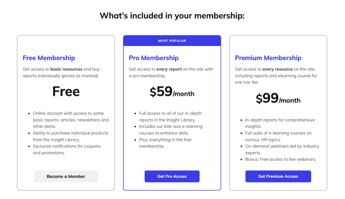
3. Is your pricing page easy to understand?
Creating a converting pricing page for your membership website requires clarity, transparency, and an engaging presentation. Start by clearly presenting each membership tier and listing the features that each plan offers. Use concise, compelling language to convey the member benefits, making it easy to compare options. The primary goal of a pricing page is to encourage visitors to subscribe to your membership website. Don’t include links or other elements that lead away from the conversion path.
Incorporate a testimonial banner to build trust. Ensure that your call-to-action buttons stand out and guide users toward the sign-up process. By prioritizing user experience and highlighting the advantages of your memberships, you can design a pricing page that effectively converts visitors into loyal members.
4. Do you have any errors or outdated information on your site?
A website with incorrect details, broken links, or outdated content can quickly turn potential members away. Broken links or missing images are not just frustrating; they can make your site appear neglected. If visitors sense you’re not maintaining your website, they’ll be far less likely to subscribe or engage. Regularly reviewing and updating your site is crucial for showcasing your professionalism and building trust with your audience.
Check if these pages and links need an update:
Are your contact details still accurate?
Is your "About Us" page current?
Are your social media links still functional?
Why a clean website design shows commitment
Revamping your membership website design is crucial for and staying relevant and competitive. A modern, intuitive design can attract new members and retain existing ones by making it easier for users to access valuable content. An updated design reflects your commitment to delivering a high-quality user experience, showing members that you prioritise their needs and satisfaction.
As part of the SubHub team, I've been helping people build, grow and manage their membership websites for over eight years. I've written blogs about a variety of topics but particularly enjoy writing about web design. Though I'm a native New Yorker, I live in the United Kingdom and am raising two sons who speak with British accents. Outside work, I'm a dedicated volunteer gardener at my local park, countryside rambler and secret K-drama fan.
First impressions are crucial to preventing visitors from ‘bouncing’ off your website. You literally have less than 3 seconds to convince a first time visitor to scroll down. And your website’s design plays a major role in how your website is judged in those critical first seconds.
The importance of a well-designed website can’t be overstated. A professional looking website design instills trust and credibility and can make a difference in attracting and retaining customers.
Your website's design needs to be clean, user-friendly, secure and mobile friendly.
In order to deliver a visually appealing, user-friendly and effective website it’s key to make sure your website delivers on these five elements.
1. Follow current design trends
Following current website design trends is a strategic choice for projecting a professional and relevant image to your audience. It signals that your brand is modern and forward thinking.
By incorporating the trending minimalist style, your website will be clean, uncluttered and easily navigable to visitors.
Website owners often mistakenly believe that ‘everything’ must be presented on the homepage. In fact, the exact opposite is true.
Having a lot of content on a website homepage overwhelms visitors making the page cluttered and difficult to navigate.
Visitors typically spend only a few seconds scanning a webpage. The consequence of an overloaded page is that users may struggle to process the information. This can lead to decision paralysis and page abandonment.
Mobile users, in particular, find it challenging to navigate a homepage with excessive content which can result in excessive scrolling.
Your homepage should provide a clear and focused introduction to your brand, its products or services and key calls-to-action. Too much content dilutes this focus making it harder for visitors to understand the main purpose of the website.
Instead of overwhelming visitors with an abundance of information on the homepage, it's best to prioritize clarity, simplicity and ease of navigation. Focus on highlighting key information and calls-to-action that guide visitors toward their intended goals. Save detailed content for interior pages. Let your users decide if they want to explore more.
Font choice plays a multifaceted role in delivering both readability and brand identity to your website design.
Every font presents its own distinctive visual aesthetic. So it’s important to carefully choose a font that matches the character of your website. For example, a playful, rounded font like Quicksand suits a website targeting children while Roboto’s lean, condensed proportions is often chosen for fitness websites.
Another important factor in font choice is ‘readability’. Select a font that is easy-to-read across multiple screen sizes. Sans-serif fonts are generally preferred for online readability.
Use a limited number of fonts. It’s recommended not to use more than three font types on a website. Choose a primary font for body text and a secondary font for headings. Having a clear distinction between these two fonts helps establish hierarchy and enhances readability.
Font consistency is another mark of professionalism in website design. Uniformity in font choices, sizes, styles and colors establishes a clear visual hierarchy to your content. It fosters readability and guides readers seamlessly through the content.
3. Use videos to boost engagement
Videos are an impactful medium to incorporate on your website homepage. They are proven to capture a visitor’s attention more effectively than static images or text.
Videos draw users in and encourage them to stay longer. They can provide a visual demonstration of your offering and create a memorable first impression of your product.
Including videos can also have SEO benefits. Search engines often prioritize websites with video content in search results. Additionally, videos often encourage visitors to linger on a page.
The length of time a user spends on a web page, known as "dwell time," can have significant SEO impact. When a user spends a longer time on a web page, it signals to search engines that the content satisfies the user's query or intent. This will improve your web page’s ranking.
Your web pages should be fast loading. A slow website affects user experience and can result in page abandonment.
The likely culprit of slow loading pages is often the presence of large file sizes of images, videos and other media. Compressing images and optimizing media files for the web can help reduce file sizes and improve loading speed.
Your navigation menus should be touch-friendly and intuitive across devices. Utilize mobile-specific navigation patterns such as hamburger menus, collapsible sections, and sticky headers to conserve screen space and simplify navigation.
5. Present a secure website
Visible website security significantly influences the first impressions of visitors. Websites that appear unsecure erode trust and lead visitors to swiftly bounce away.
Conversely, a website displaying tangible signs of security sends a clear message of reliability and commitment to user safeguarding.
A site secured by https encryption, an SSL certificate, displaying a privacy policy and transparent opt-out cookie policy fosters user confidence.
It informs the visitor that you take your commitment to their data protection and privacy seriously.
Conclusion
Designing a professional-looking website involves a combination of thoughtful planning, attention to detail and adherence to best practices. By following these five tips, you can create a website that functions effectively, engages users and establishes credibility.
It's time to build your membership website
Book a demo and see everything that's possible with SubHub.
Niche content membership websites have become an increasingly popular means for individuals with specialist knowledge to offer exclusive content, build a community and generate revenue. However, despite the potential for success, many membership websites fail to achieve their goals.
Before launching your membership website, it's crucial to understand the typical reasons that lead to failure. By identifying these stumbling blocks, you can take proactive steps to avoid them and increase your chances of building a successful online business.
In this article, we identify into the top ten reasons why membership websites often falter. We examine each failure point, and present you with knowledge and strategies to overcome them and position your membership website for long-term success.
1. Lack of clear value proposition
What do members get out of joining your site? If you can't answer this question clearly and concisely, then you're going to have a hard time convincing a visitor to become a member.
Without communicating a compelling and distinct value proposition, your membership website will struggle to attract and retain a loyal user base. Here's why a clear value proposition is crucial for a successful membership website:
Differentiation: A clear value proposition sets your membership website apart from the competition by highlighting its unique benefits and value.
Member Motivation: A well-defined value proposition addresses the needs, desires and pain points of your target audience. It demonstrates how your platform can provide solutions.
Clear Communication: Your value proposition should be concise and easily understandable ensuring that potential members quickly grasp the essence of your membership website.
Conversion Optimisation: Value propositions that are well crafted and persuasive can significantly impact conversion rates by effectively persuading visitors to become paying members.
Tip: You can strengthen your value proposition by defining your customer persona. Through understanding your customer persona, you're able to identify and address their pain points in your messaging. This lets you position your membership website as a solution provider and can enhance its perceived value.
2. Poor quality content
High quality content is the lifeblood of any membership website. It's what keeps members engaged and coming back. Regularly updated and relevant content creates a sense of anticipation, value and exclusivity. It increases conversions. When people find your content to be valuable, they are more likely to take action, such as signing up for your newsletter or purchasing a product.
By delivering content that addresses member pain points, educates or provides insights, you reinforce your value proposition and build trust.
Compelling content helps differentiate your membership website from its competitors. By offering niche content, you can carve out a unique position in the market. This differentiation enhances the perceived value of your website and gives members a reason to choose and stay with your platform.
Quality content also helps to drive traffic to your website. When people find your content to be informative and helpful, they're more likely to share it on social media. Other websites will reference it and these backlinks will improve your search ranking because Google then sees your site as a trusted authority on your subject.
Tip: By creating content that targets relevant keywords, you increase the visibility of your website in search engine results. This can attract new members who discover your content through organic search, expanding your potential audience.
3. No free content
The natural tendency of membership website owners is to hide all of their content behind a paywall. This is a mistake.
Every membership website should make a percentage of its content free. Providing free, regularly updated content serves several purposes:
It drives organic search traffic and shares.
It builds trust with visitors by sharing valuable content for free.
It enables you to establish authority and credibility on your topic.
It gives visitors a reason to return or sign up for a newsletter.
Offering free content is a powerful marketing tool. It demonstrates the value and credibility a membership to your website provides. It's a powerful tool to attract, engage, and convert visitors into paying members.
4. Bad user experience
Design is important.
You only get one chance to make a first impression. In fact, statistics report, you have less than 6 seconds to make a positive impression that convinces a visitor to scroll. A membership website that is difficult to navigate, has slow loading pages or lacks intuitive features can quickly turn off users. Frustrating user experiences can result in high bounce rates and low member retention.
There are many membership platforms to choose from. Do your research and find one that fits your needs and has excellent customer support.
5. Complicated membership options
Complicated membership plans and pricing tiers can introduce unnecessary friction in the sign-up process. This friction delays a visitor's decision to subscribe.
Simple membership plans play a significant role in the success of a membership website. They eliminate confusion and enable potential members to make quick and informed decisions.
When presented with a limited number of well-defined membership options, users can easily understand the benefits, features and pricing associated with each plan. This transparency reduces decision fatigue, fosters trust and promotes a positive user experience that increases conversion.
Tip: Ideally, you should offer no more than three plan tiers. Each plan should offer a distinct value proposition. The benefits of each plan should be clearly listed to differentiate the levels of content access and features. When a user can quickly grasp the value proposition and pricing structure, they are more likely to sign-up.
6. Ineffective Marketing and Promotion
Without proper marketing and promotion, even the most exceptional membership websites will struggle to attract an audience.
However, you don't need a big budget to effectively promote your website just social media savvy. Before launching your website, establish yourself on the social media platform where your target audience is most active. Build an audience by regularly posting and actively engaging with your followers. Use the channel to build trust, present yourself as an authority and drive traffic to your website.
7. Lost prospects
People rarely find a website and immediately reach for their credit card. You may have to convince them over time. The problem is over 90% of visitors, even if they like what they read, will never return and will become lost prospects.
In order not to lose these potential members, your website’s number one goal should be to get a visitor’s email address. Once you have their email, you can begin to build a relationship through ongoing communication like a newsletter or special offers.
Tip: To capture a visitor's email, implement an opt-in strategy using a compelling lead magnet. In exchange for their email, offer a piece of valuable content. Your incentive could be an ebook, discount, checklist or free online course. The lead magnet should align with the interests or address the pain points of your target audience.
Place the opt-in form strategically on your website, as a pop-up or banner and clearly communicate the benefits of subscribing. Keep it simple. Ask for only essential information like a name and email address and assure them their email will not be shared with third parties.
8. No sense of community
A strong and engaged member community promotes connection, engagement and collaboration. This leads to increased satisfaction, retention and advocacy. Active members are more likely to renew their memberships, reducing churn and sustaining long-term success.
Community can be nurtured through comments, forum discussions, live webinars and Zoom classes.
Active members are also ambassadors for your website. They can drive traffic and conversions through shared posts, testimonials and reviews.
9. Limited to a single revenue stream
While membership subscriptions will form your core revenue source, additional streams allow you to broaden your customer appeal and maximise your earning potential.
Some visitors may not be ready to commit to a membership, but will be interested in purchasing access to an individual course or specific piece of content. By diversifying your offerings, you can cater to different customer preferences and generate revenue from those who aren't interested in membership. You'll also capture their email for future marketing efforts.
Creating additional revenue streams isn't difficult. There are many ways you can repurpose and sell your existing content using different delivery methods. Blog posts can be offered as pay-per-view products and paid downloads. Your video tutorials can be adapted into courses. Access to events and webinars can be sold.
10. No social proof
Websites without social proof are at a disadvantage as they lack the validation of users.
Social proof should always play a prominent role on your website as it establishes trust, credibility, and legitimacy. It leverages the influence of existing satisfied members to attract and convince new members to join.
Social proof can take various forms, including testimonials, reviews, case studies, user-generated content or social media engagement.
Tip: Make a concerted effort to get member reviews posted on a trusted review site. Open a Google My Business page and start collecting reviews.
Conclusion
Now that you know some of the factors that contribute to a website's failure, you can use this knowledge to build and grow a successful membership website.
Free membership ebook
Download our five-step guide to a profitable membership website
Ready to transform your knowledge into an online business with a membership website but don’t have the time or skill to build it yourself? Our design service could be the solution.
Converting website visitors to paying members is of course, one of your primary goals as a membership business owner. There are many factors involved in making those conversions, but one method that could put you on the fast track is to provide a lead magnet.
Too many choices can overwhelm customers. Keeping your pricing options simple and clearly defined increases conversion by removing friction and reducing confusion.
Learn five high-impact strategies to boost user engagement on your website homepage, build trust and turn passive visitors into active customers. These practical tips are easy to implement will help you optimize your homepage for maximum results.
If you’re a yoga teacher attracting local students to your studio, you may be looking for opportunities to generate more income from your business. You may already have an online presence - a website, Facebook & Instagram postings, maybe even TikTok videos. But an online presence doesn't necessarily equate to an online business.
Identifying your customer persona, buyer persona or target audience profile, is crucial before launching a membership website. Understanding who your audience is allows you to create targeted marketing campaigns, improve user experience, develop relevant content, optimise pricing strategies, and foster long-term growth.
Are you ready to transform your knowledge into a thriving online business with a membership website but don’t have the time or skill to build it yourself?
Many people, with an expertise to share, are turning their knowledge into income by selling access to it using a membership website.
By putting your knowledge behind a paywall, you can turn it into a recurring revenue stream through the sale of memberships, courses, digital downloads and pay-per-view content.
Do you have an expertise to share but aren’t a web designer? Let our expert build your membership website.
Your site will be built using SubHub’s membership website builder
SubHub is an all-in-one membership platform that specialises in providing all the functionality you need to build, manage and grow a knowledge business. There’s no need for plugins or complex setups. Everything is in one place. SubHub makes membership easy.
Your site will include all the built-in features the SubHub platform has to offer - subscription levels, integrated payment gateways, course creator, landing page builder, forum, member directory, store and more.
What our design service includes:
Our design service will deliver a professionally-styled, secure and mobile-friendly membership website designed to convert visitors into paying subscribers for only $750 USD.
We’ll design an engaging public homepage to match your brand and showcase the benefits of your offerings and a member's homepage for when subscribers log in.
Intuitive and user-friendly navigation menus will be created so your visitors and members can easily find the content they're looking for.
Your content will be organised and enough will be uploaded to launch your site. We can even create bespoke interior pages.
After you provide content and visuals, our expert will then build your mobile-friendly website to showcase your brand and communicate your expertise.
We’ll send recorded run-throughs of the work in progress so you can provide your feedback.
We even record individual tutorials so you’re comfortable and ready to manage your website on your own.
SubHub is more than just a software
Our commitment to you doesn’t stop after we hand over the website to you. You’ll continue to receive outstanding support from our 5-star team which always impresses our clients with their dedication. We don’t send scripted replies but thoughtful information along with screenshots and bespoke video tutorials.
For a membership website, it’s not just about likes and followers; it’s about building trust, nurturing community, and converting interest into paying members.
Never underestimate the impact of a well-crafted teaser on a reader or website visitor. This brief yet informative text can be the deciding factor that compels a reader to fully engage with your content.
Creating a membership website homepage is more than just designing a visually appealing page; it’s about crafting an experience that guides visitors seamlessly toward becoming subscribers. Membership homepages need content designed to introduce, inform, build trust, peak interest and prompt the subscription of a visitor. And they also need to be optimised with keywords to be found by search engines.
Getting your first 100 paying customers for a membership website is always the hardest part. But once you reach that number, it becomes much easier to attract new members.
We've put together a 90-day plan for you to get your first 100 paying customers.
Starting an online magazine has never been easier. Whether you are an individual with a passion for a specific niche or a business seeking to expand its online presence, the wealth of affordable and user-friendly tools makes publishing an online magazine achievable for even a solopreneur.
These days, if you're looking to manipulate or edit your photos and images, it shouldn't mean you have to purchase expensive software or engage a professional graphic designer. A lot of the functionality that the majority of people need is available with free or low-cost web-based image & photo editing software.
Using headings effectively on your website’s homepage is essential for both engaging users and optimising your site for search engines. Well-crafted headings not only capture attention but also play a vital role in guiding your visitors and improving your SEO performance.
Color is a visitor's first point of engagement with a website. This makes choosing the correct color scheme essential. Not only do color choices, create brand awareness, they actually trigger specific emotions and influence conversion rates.